
Lots of people have been asking me about inking lately, so I'll try to remember what I learned about it a long time ago and post it here. My first job ever in animation was inking, and there were so many rules to follow that they all had to be written down on a 2 page memo for all the inkers to post up in front of them. I wish I had those now, cause I'd just post them!
So anyhow, here's a picture of the pens I like to ink with best:
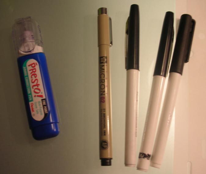 Those black and white pens on the right are "boldliners' made by Eberhard Faber (that's what they're called, right?). I'm pretty sure they don't make them anymore, which is awful because they're the easiest inking pens I've ever used. They're cheap marker pens with felt tips. They're good because when you start out using them, they have nice sharp points, but after a while begin to get mushy at the end, making it easier to put pressure on them to get thicks and thins. There are other felt tip markers you can get, and they work alright too. Then I use Microns for small and delicate lines, and for fixing up any wobbly lines that the boldliners made. The white out is my best friend when inking, because I tend to put my hand right into the wet ink and smear it all over the place.
I had to ink an older drawing a couple of days ago for a poster, so I took a few pictures to show the ink in progress. I don't know if it'll be helpful to the people who asked about inking...I hope so!
 I always start with the thickest lines first, and leave any details for last.
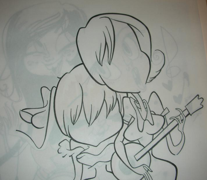 I think that the head on the right girl has nice thicks and thins, but the rest of her body and arms need to be made more consistent...right now all the lines are the same thickness and it's not as interesting looking.
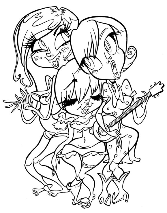 Here's the finished ink, which turned out alright, even though there are some things that could be better...for instance, the place where the middle girl's hip comes too close to the right girl's dress. The lines get all mushy in there, so I'll probably have to fix it later. It's hard to avoid tangents when inking something crowded like this drawing, but I think I avoided some that were in the original drawing.
So here are the rules I remember from when I inked for money!
-Use nice thicks and thins.
-Thick lines are for larger shapes and shapes that are closer to you.
-Thin lines are for smaller shapes and details.
-Details within the drawing, like smile lines or clothes wrinkles, should help to describe the larger shapes that they are a part of.
-Try not to ink inside or outside of the lines, but stay on top of the original drawing.
-Make sure lines follow through. For instance- if I took away the instrument that the girl on the right is holding, the lines on her body and arms should look like they would connect.
-Floating lines, like smile or cheek lines, should go from thin to thick to thin, with the middle being thicker. It looks meatier that way!
-Lines that end should taper to a nice pretty point.
-Pay attention to subtleties in the drawing, and try not to dumb them down when inking over them.
39 comments:
VERY informative Katie, thanks so much!
Thanks, Katie! That's really great advice. I plan to ink my own artwork someday, and I'll use those helpful tips you gave (no pun intended).
In case you want to see it, Wil Branca has episodes 6 through 12 of "Weekend Pussy Hunt" at his site:
http://www.ohyippee.com/wilbranca/animation.html
wow that was very help full...I sort of learned to ink from Spumco too but it was indirectly threw admiring there comic books in High School and college. Your inks are FAR superior though, I envy your training and tallent! lol Keep up the good work!
Beautiful! I appreciate your demo, Katie, word is bond. I have some friends from AI that I learned inking from myself, but I was always pushing myself for the kind of quality Spumco dished out. And now it's time for me to take notes and practice!
hey katie!
are you using a light table or something to ink? i always used a lighttable and a brush, but it looked to me like you might have some thin paper you're using over top of the original drawing? maybe you mentioned, i kinda skimmed [like a jerk!] but this is a helpful post!!! thanks!!!
:: smo ::
Now it's plug time!
Haha. Very nice post.
could you post an image of the pens with the caps off. great post i just thought you used a brush and ink.
Why do I find cartoon women so attractive?
Bono is Brian Peppers!
Thankd for the post, the information was great! I prefer the Sataedtler pigment liner's over the micron pens, but to each their own.
And then practice practice practice! That's some useful stuff ya posted there, Katie. Plus more amazing drawrings.
I use a lot of those same pens and techniques but I sure don't get the same results!
What I liked about the Bjork notes were their specificity. When I was in graphic design, too many times the instructors would just look at the work and go, "Hmmm..."
"Is this right? Am I getting it?"
"Hmmm..."
thanks for the info, but i just dont seem to be able to get the hang of inking!!
nightmare!!!
Great lines! Great colors! Great all!!! :-) I am a Katie's fan!!! I am a brazilian cartoonist (and percussionist) and would like inviting you to visit my site. it calls sivirino. look at www.sivirino.com.br. greate katie! sucesso pra você! (success 4U)
Jefferson Portela
Katie! Maybe someone already told you this, but I got the Nintendo magazine yesterday and I saw one of your Link pictures in it, on the centerfold!
If you want me to scan it or something let me know... wouldn't be any trouble... but maybe you already have it?
Did anyone else see it?
Hey, Katie! That was a sweet post! Thanks for all the sweet inking tips. I've never inked before so I better learn quick!
How do you scan your finished ink and get it so clean looking?? I've gone over my pencils drawings with ink before and they never looked that clean. There was always smudge and dist everywhere. Do you digitally clean it up?
I have to say -- This is the most useful post that I've come across ever! I'm cooking something up as we speak. The tips give your product some direction which is not always easy to find if your not trained in the field!!
I'm so sorry I will miss you guys in May. Out of town...
Thanks for the tips! Good stuff.
Cool inking tutorial Katie. Your poster inks look great.
And thanks for the plug!
Hot cartoon women...
R2K
wow! that's amazing! I do have to second that question on inking paper. do you use thin paper of the regular drawing? then when you're done, what do you do with it to make it go onto regular paper without losing its integrity?
maybe this is something artists know, so if it's a waste of time answering easy questions, don't bother. it's just that reading about how you work makes me so curious!
katie, any recommendation on pen brands that are still available?
Hi Katie!
You are a doll.
Thanks so much for taking the time to post these tips and tricks!
So cool.
Thank you, thank you, thank you!
...i
I'd like to see how the inking was transfered into flash for WPH. With clean up techniques and all that as well.
Hey Katie when you ink do you trace over the line like a tattoo artist would with maybe two or three passes for a thicker line or do you try and keep it loose with extrordiary control? Its hard to get that clean point like you were saying when a line ends. Your help would help me alot.
great inking tips! seeing as how i can't ink at all, maybe i should start practicing. Nice line weights on the girl band group too!
i found these pens today called Pigma Brush, they are really cool.
Just to put my 2 cents in, for fine detail work I find you can't beat Staedtler Isograph pens. Expensive, but refillible, and I've never hear of one wearing out. Also Faber-Castell do a neat brush pen, it has a felt tip and doesn't last that long (a couple of weeks with daily use I find), but it's cheap and you get a decent black.
Fascinating and useful stuff - please could you tell me how big the posters are that you've inked, or maybe put the pen on the artwork when you take the phot for some idea of the size of the artwork?
Do you just draw on any old paper?
This is a great post!
Very informative :)
I like the Pitt brush pen /Pitt Super fine pen myself. Hey Katie! If you have a hard time finding the Boldliners, try the Pentel Sign pen! It's similar, and contains a denser black ink!
you are on fire!
-heri
I vote for Sign pens, too. : )
http://www.animationarchive.org/
everybody go there for some never before seen Katie Rice drawings! :)
Thanks everyone for the recommendations! I have to go pen shopping now...
:: smo :: - I used to have a light table that I used, but it's broken...so right now I just draw on a glass-top table and put a desk lamp underneath.
eebs- yeah, I jsut saw that recently...crazy! I have a copy for myself, but thank you for offering to scan anyhow!
Jorge- Usually I ink on a seperate piece of paper, over the original drawing. That makes it so you don't have to worry about pencil lines. If you ink directly over your pencils, it's easier to draw with blue pencils, so you can eliminate them in photoshop later. I usually fix any mistakes in whiteout, but occasionally end up fixing some stuff in photoshop.
kat- I ink on all sorts of paper, depending on what's available. Usually animation paper is alright for inking, because it's slightly see through, and the pens don't bleed so bad on it. I'm not sure what you mean by your other question though, sorry!
evan- no, sorry...I'm sure some of the pens people recommend here are good, though. Your best bet is experimenting with different sorts!
tom- I'm sorry, I don't know how it was done! I just did the inking. :(
anonymous- sometimes for thicker lines it's neccessary to go over the line more than once...I think it's best to try and get used to doing most the lines in one stroke.
pbeare- the poster ink is about the size of a piece of animation paper. I'm not sure how big it will be printed, though!
stefano d- I'll have to try them out!
lacie- yes, I usually ink on regular printer paper or animation paper.
r&s 2600- I can't help you with inking with a brush, because I'm terrible at it! the same rules I listed before would still apply though, regardless of the tool you use to ink.
The curves on those women are huge.
is that bad? :(
Thanks a lot for these really useful inking tips!!! :D
Benjamin
halo katie rice, my name is reane :D i really love ur artwork.. its really inspiring
thank you for the post
inking could be fast, nice ..also i think i might get maker :D those tool really useful
even its expensive T_T
Say, I'm curious, but have you used Sakura Pigma Brush pens?
Thank you Katie!
Stellar inking!
(that drawing sparkles)
Post a Comment